
Data Visuals


We can produce a range of data visualisations that the role will require. Using Excel, R (ggplots2), Data wrapper, flourish, PowerBI and Canva, I can produce a range of charts. This includes bar charts, pie charts, doughnut & semi-circle plots, scatter diagrams, bubble charts, line graphs, histograms, density plots, box plots, violin plots, tree maps and Sankey diagrams. I can also map data using geospatial data to produce heat maps, constituency maps, hex diagrams and parliament charts to show the spread of data across a defined area. I can also use Canva to produce infographics for basic descriptive statistics. With these strong range data visualisation tools, I have been able to produce data-driven stories engaging a wide audience on a broad range of subjects.
Capture Politics can produce a range of data visualisations. Using Excel, R (ggplots2), Data wrapper, flourish, PowerBI and Canva, we can produce a range of charts.
This includes (but is not limited to) bar charts, pie charts, doughnut & semi-circle plots, scatter diagrams, bubble charts, line graphs, histograms, density plots, box plots, violin plots, tree maps and Sankey diagrams. We can also map data using geospatial data to produce heat maps, constituency maps, hex diagrams and parliament charts to show the spread of data across a defined area. We can also use Canva to produce infographics for basic descriptive statistics. With these strong range data visualisation tools, we can assist in a range of data visualisation needs.
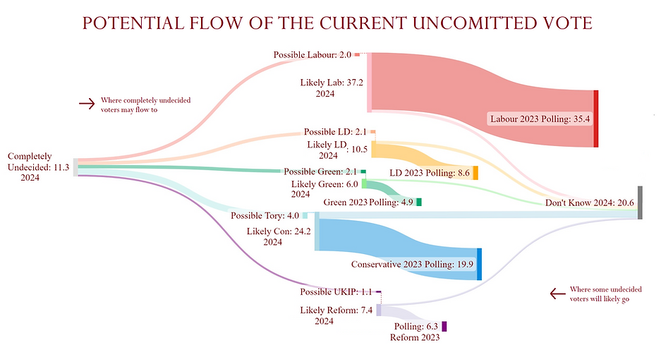
Below are a few examples of infographics we have used in the past with a range of publishers.


.png)


